Background
Thinking back at the time when I started to pay my electricity bills, I knew I didn't want to experience the stress of joining long queues at the Electricity Distribution Company outlet, a simple google search gave me a solution; BuyPower. Fast-forward to a few years later, I am privileged to be a designer on the team.
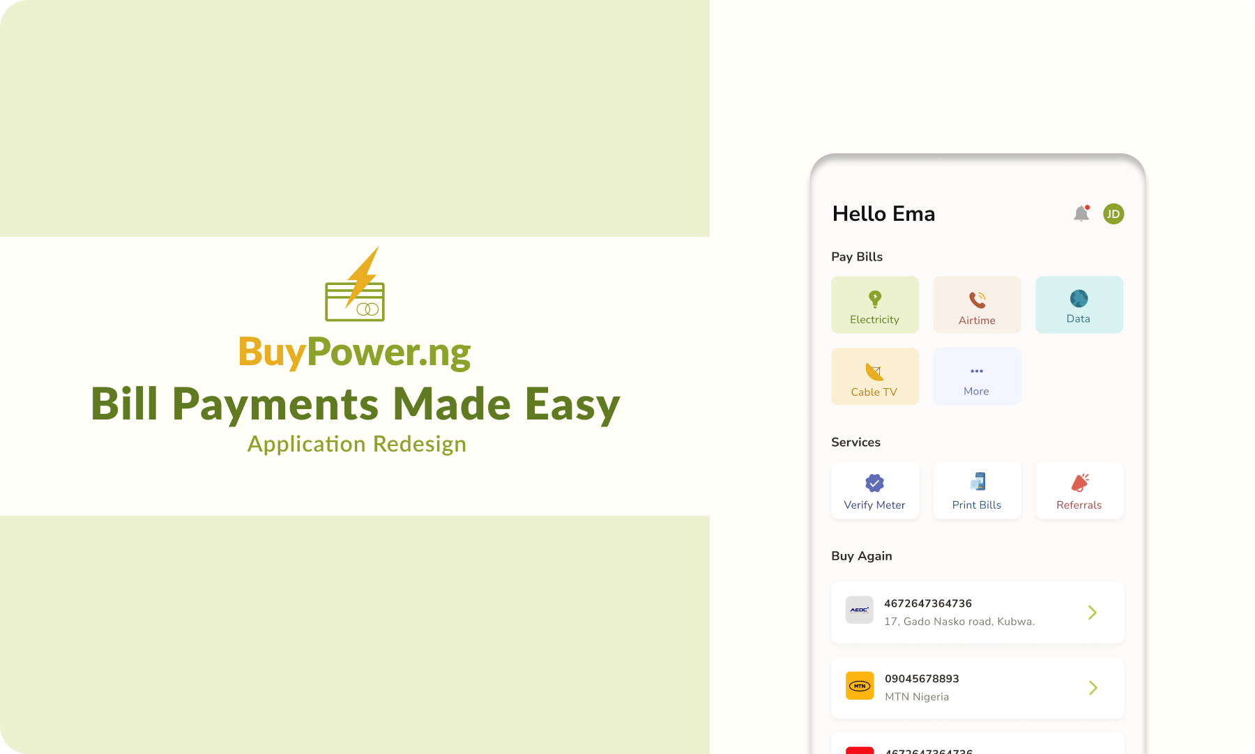
BuyPower is a widely used platform in Nigeria for conveniently paying electricity bills.
In this project, we redesigned the mobile application to address users’ frustrations, give the app a more updated look, and offer our customers new services and features.
Goal
Add more features to the application (Scheduling payments, Meter verification, Airtime, Data and TV subscription purchase).
Generally, improve the performance of the app.
Learning User Painpoints and needs
Apart from the new look and adding features, we needed to relieve the pain points highlighted by the current users potentially. We had pre-existing insights about our users from reviews in the Play Store & also from the customer support team who have spent time understanding their needs.
.png)
The Discovery
When tokens are not delivered due to failed or pending payments, users feel lost in situations like this.
There is little to no self-help on the app and there is massive dependence on the direct intervention of customer support agents.
People make the mistake of vending for the wrong meter because the app saves every meter used on the app.
How might we?
How might we improve and encourage self-help on the app?
How might we inform customers of any outstanding debts so they can make informed decisions before payment?
How might we help users trust the app?
How might we replicate the electricity flow, for other services?
I visualized a journey map using research data to reflect the current experience.
.png)
General Structure
Compared to the old version of the app, the information architecture was different and this helped guide the flow of the pages.
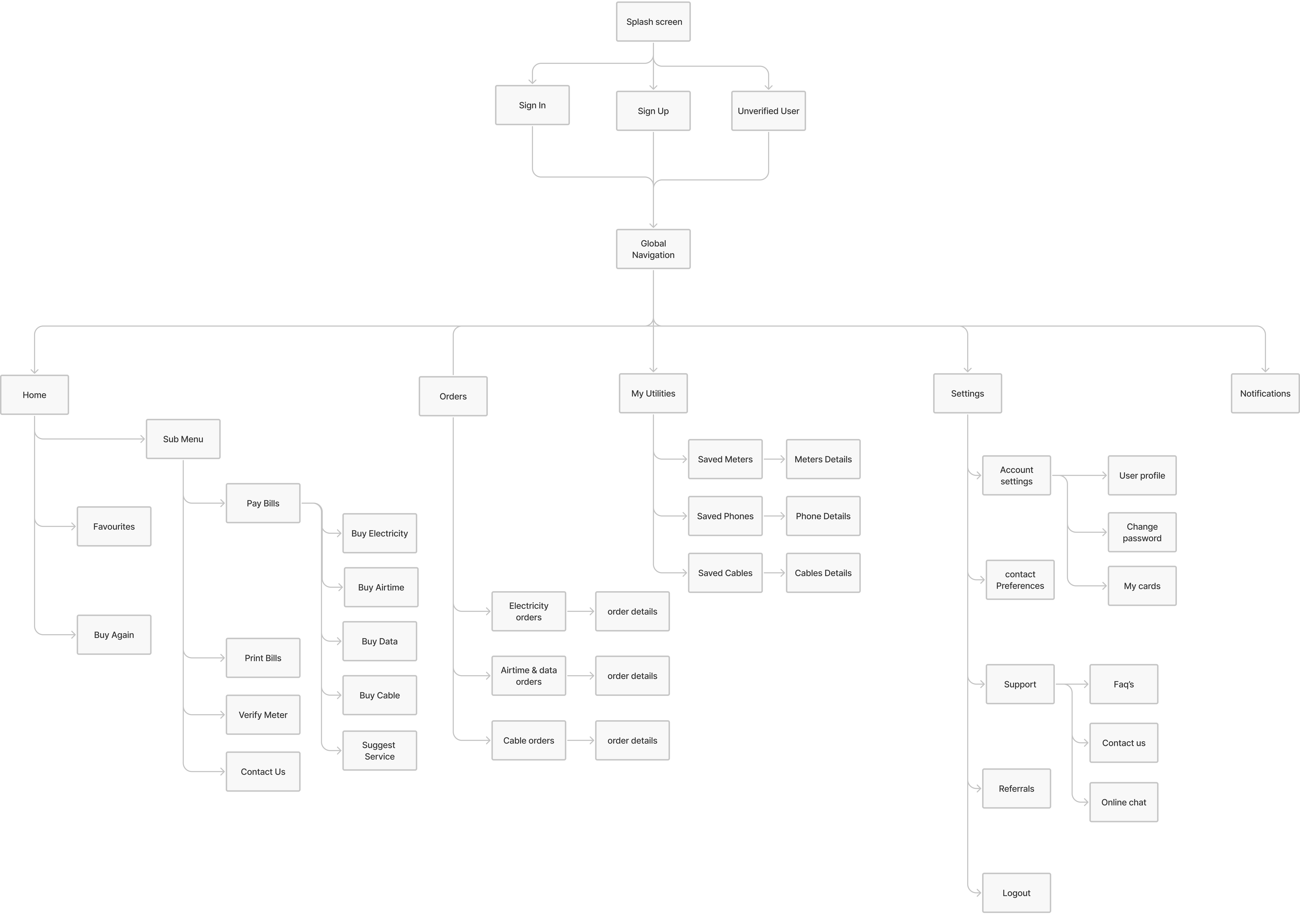
Wireframe
Using the structure and user flow, helped us visualize the screens we were going to create, it also allowed us to prototype different layouts rather than focusing on design details.
Visual Design
Setting up the design system was crucial to keeping the team's designs consistent;
_(1).png)
HomeScreen
The hamburger Menu made some features undiscoverable so we decided to go with a tab bar, the home screen has been separated into parts to make good use of the space as seen below.
.png)
Airtime flow
The flow to purchase airtime on the app.
.png)
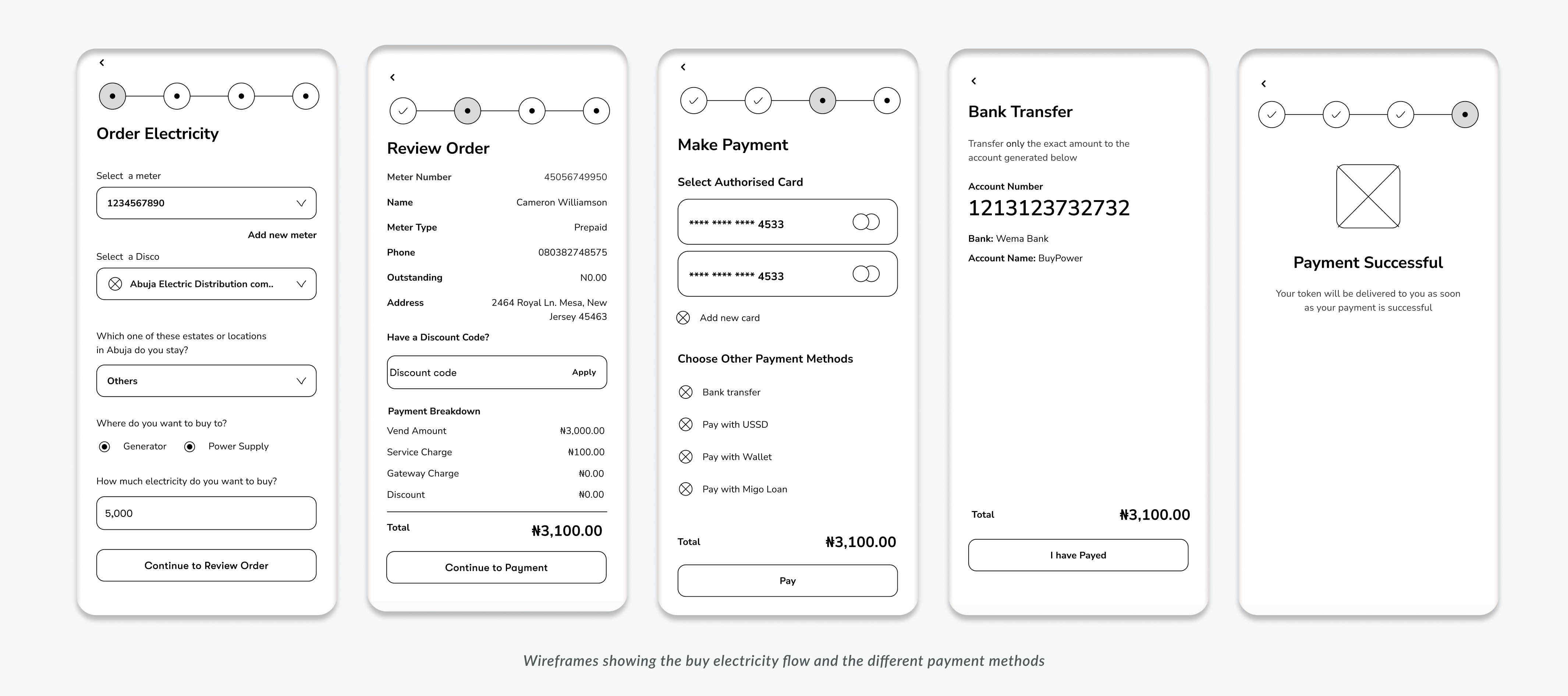
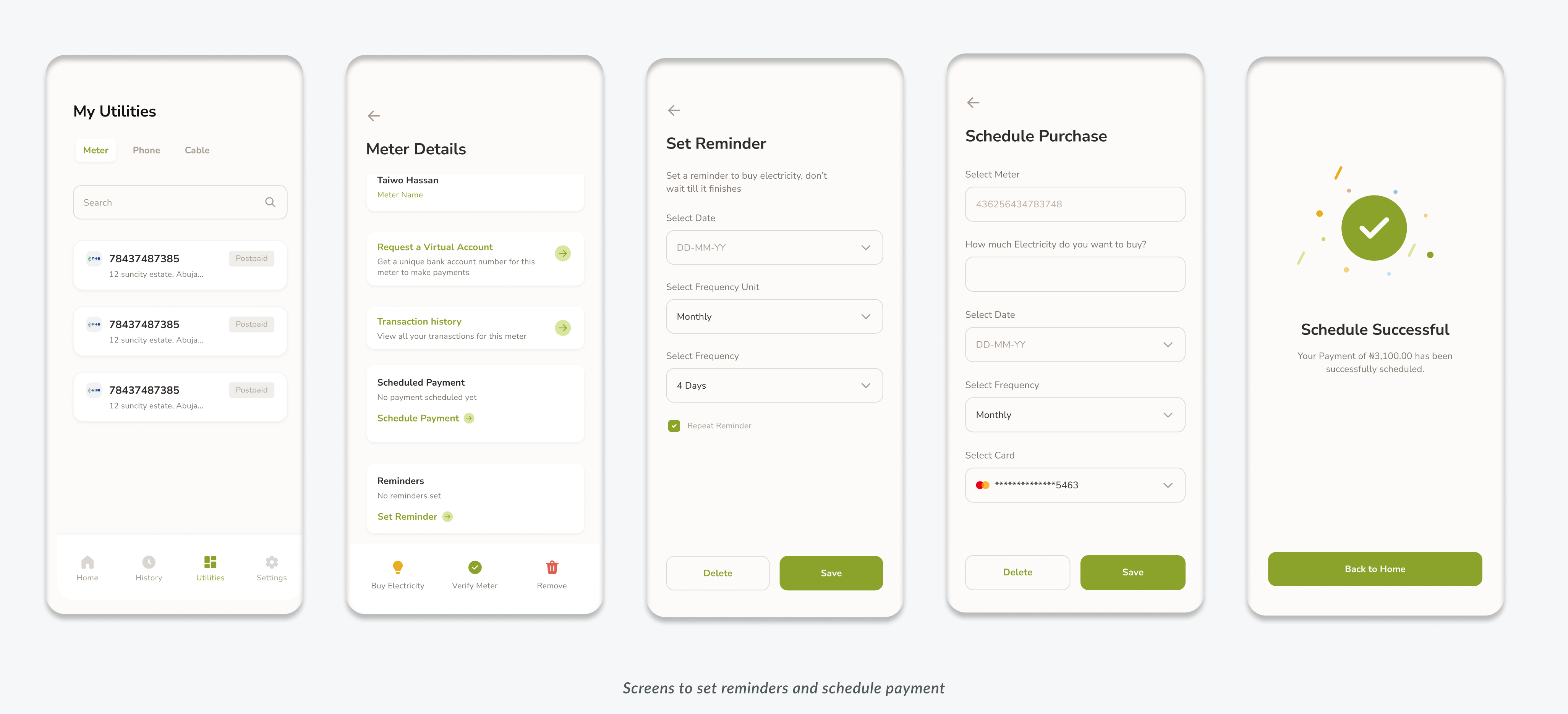
Scheduling Payments & Reminder
This feature was made for the users who specifically have authorized debit cards, they can set a date and time for the system to vend for them automatically and then send value to the user.
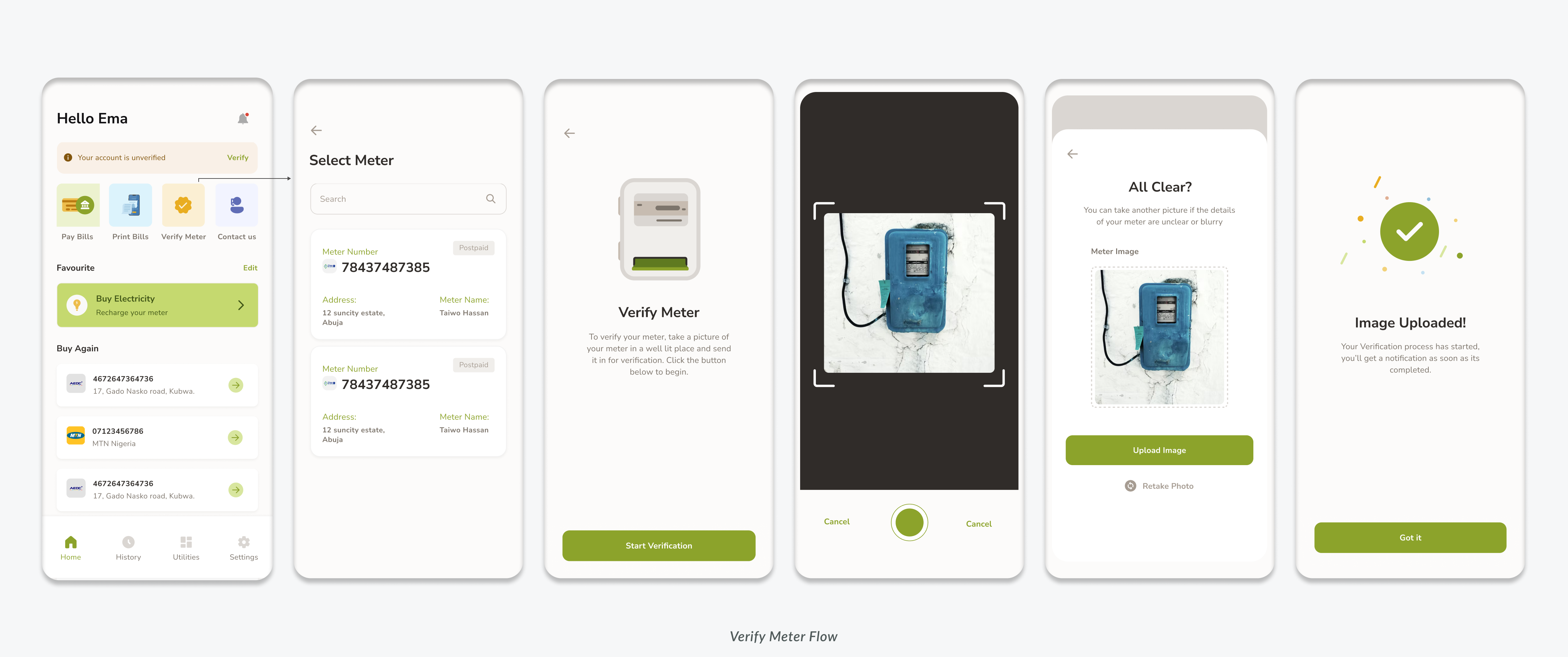
Verify Meter
One of BuyPower’s value offerings is the provision of utility bills to users, with this feature, users can verify their house addresses by taking a photo of their meter, once the location is verified, users can get verified utility bills that are acceptable in financial institutions and embassies.
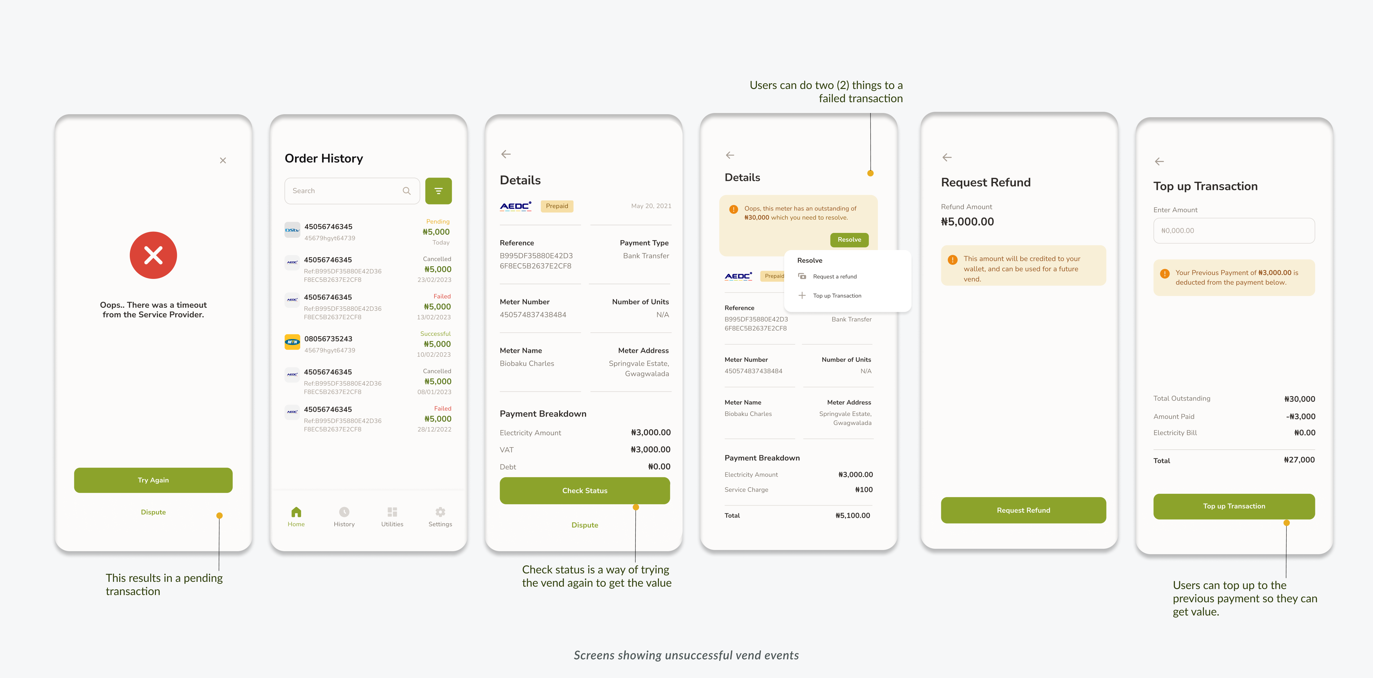
Failed Vend flow
BuyPower works with a lot of third-party services and this can resort in disappointments beyond our control, this flow gives users a sense of control over such transactions instead of always contacting customer care for these issues.
In the use case of a failed vend due to service downtime, customers would be able to check the status of the transaction directly from the app and get their token.
In the use case of a failed vend due to debt; users can top up the previous payment and get their value or fund their wallet with the payment.
Prototype
To get a feel for how the app would work if it were live, a high-fidelity prototype was built. This was a great avenue for the first round of testing by the internal team, we had some insightful feedback.
Some of the feedback we got from the test were;
Users will need to select the meter they want to verify before going ahead to take a picture of it, another screen has been added to improve the flow.
The navigation bar icons were not labelled until it was tapped, we added text labels for easy identification.
The previous app did not have an onboarding process, but it would be good to have it on the new design to introduce the new and exciting features to the user.
Beta Testing and Next Steps
Beta Testing will continue with a larger subset of users, our iterative process will be driven by user feedback and market demands. This keeps us at the forefront of meeting our user needs.

.jpg)